This article is a copy of my one - complete with a voiceover if you'd prefer to listen to it - over on the BBC GEL website.
Error messages have a lot of ground to cover.
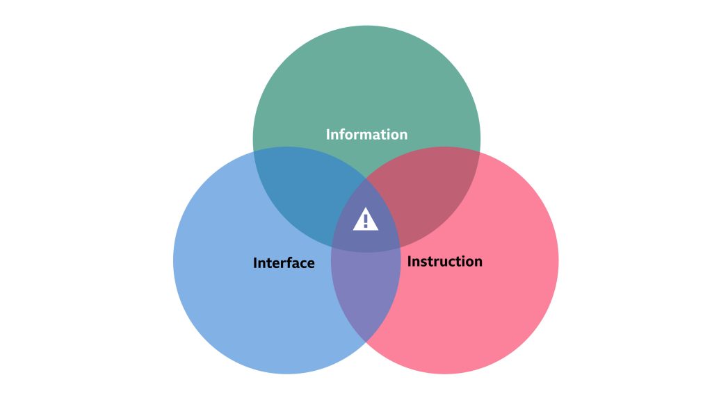
They pose the challenge of combining almost all the different elements of UX Writing - information, instruction, interface, microcopy - and doing them well in a handful of words.
They unite in search of a common goal: help the user when something goes wrong.
But that's an oversimplification. Because they also have a responsibility to:
The structure of your site or system - Users nor developers want to see a near infinite number of one-of-a-kind text strings. So you need to consider the context of the system you're writing for. Root out any requirements or limitations before you start to keep error logic as simple and consistent as possible.
The overall experience - Draw from existing design patterns, or work together to craft a new one that complements both design and content requirements. Users rely on familiarity, and reusing linguistic patterns in the same way that you reuse design patterns is good news for everyone.
The brand and product - Be faithful to the Voice and Tone of your brand or product, balancing it with context and user mindset.
So how do you write error messages that help everyone and the user? Where do you start?
It's tempting to just start typing. Every message will get one-to-one time with your brain, so every error will be perfectly crafted and written-to-order!
Good? Well, not always.
If you're working on a new website, tool or system, you're going to be writing a lot of them. If you're adding to one, then there's probably a few lying around already.
There are stakeholders too: designers, developers, the brand, that all benefit from a well-crafted, consistent approach to handling errors.
And users need them to help out when things go awry - so they had better be helpful.
So instead of writing error messages, think building.
If you're creating a whole new website, tool or system, get the team together and start listing all the things that could go wrong like:
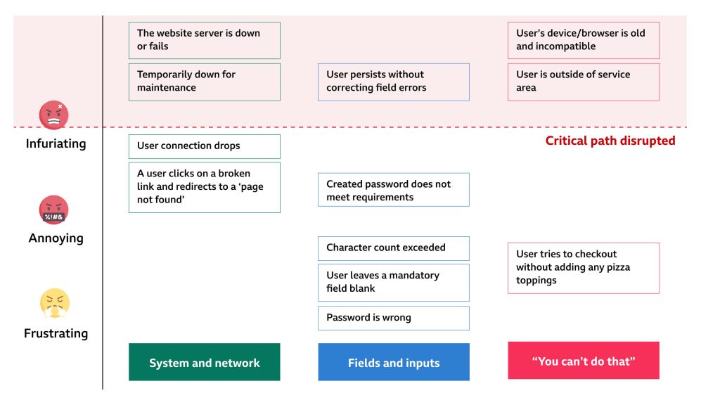
Start grouping them - your groups will depend on the product you work on. But here are some examples:
Now place them a scale of annoying to infuriating. This part is borrowed from the Content Design team at Deliveroo, who have written a great article on error messages too.
Somewhere on that scale, there's a point where the error stops the user from completing their journey in that session. The user nor the system can fix it. Their critical path is disrupted.
Once you've built some foundations, you can give your error messages structure. This way, error messages stay consistent. And they are never longer than they need to be.
If only they did… eh?
Once you have a defined structure, you have a good formula - blocks to build every error message users could meet.
You can now start writing error messages like this:
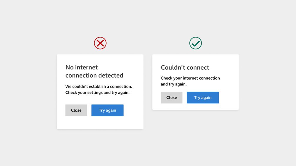
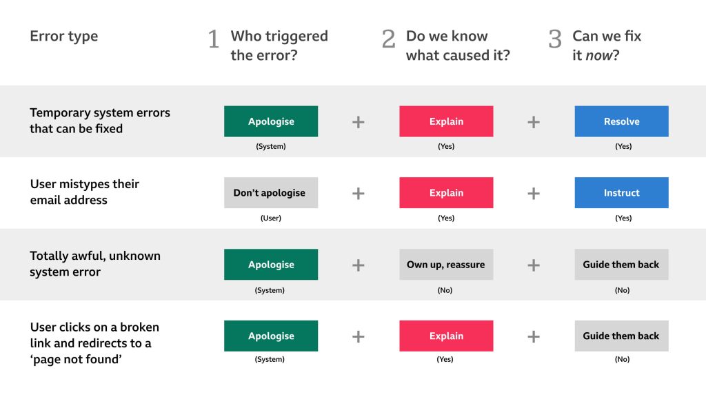
[Explain] [Instruct]
[Apologise] [Explain] [Resolve]
Or in really bad cases:
[Apologise] [Own up, reassure] [Guide them back]
Doing it this way keeps sentence structure simple, clear and consistent, which is good for everyone.
Users get more familiar and process them faster. Designers can anticipate spacing and design patterns. Developers can start framing levels of detail that logic and field validation might need.
So now you know what your error needs to do, how do we decide what to say?
Let's take our building blocks, and filter in the other things like:
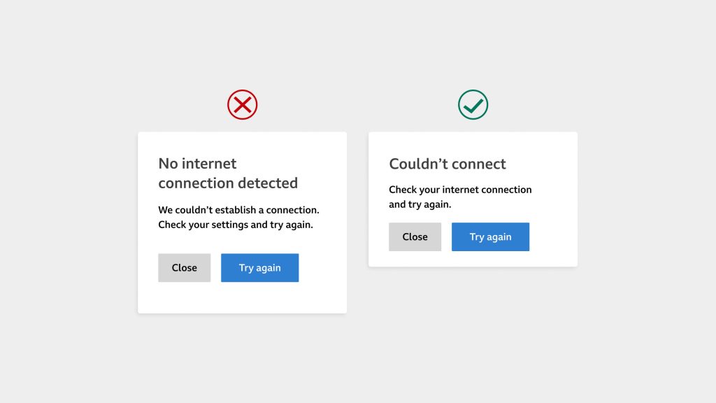
First and foremost, your error message should always be clear and precise. It should sound human, and only use words that you would say out loud.
Your product should also have a consistent personality - or Voice. Some brands, like exclusive banks, sound more formal because it makes your money seem secure and safe with them. While others, like in fashion, gaming or sports can be more talkative, informal and even irreverent.
Write through the filter of your brand's Voice all the time. It should already consider who your audience is, as well as why and when they use your product.
If your brand's Voice is fixed, then your Tone is what changes from one situation to the next.
If the error is minor, like a mistyped email address you can be casual and helpful at the same time. If it fits your brand's Voice, you can play with adding warmth or humour. But it should never make your message harder to understand.
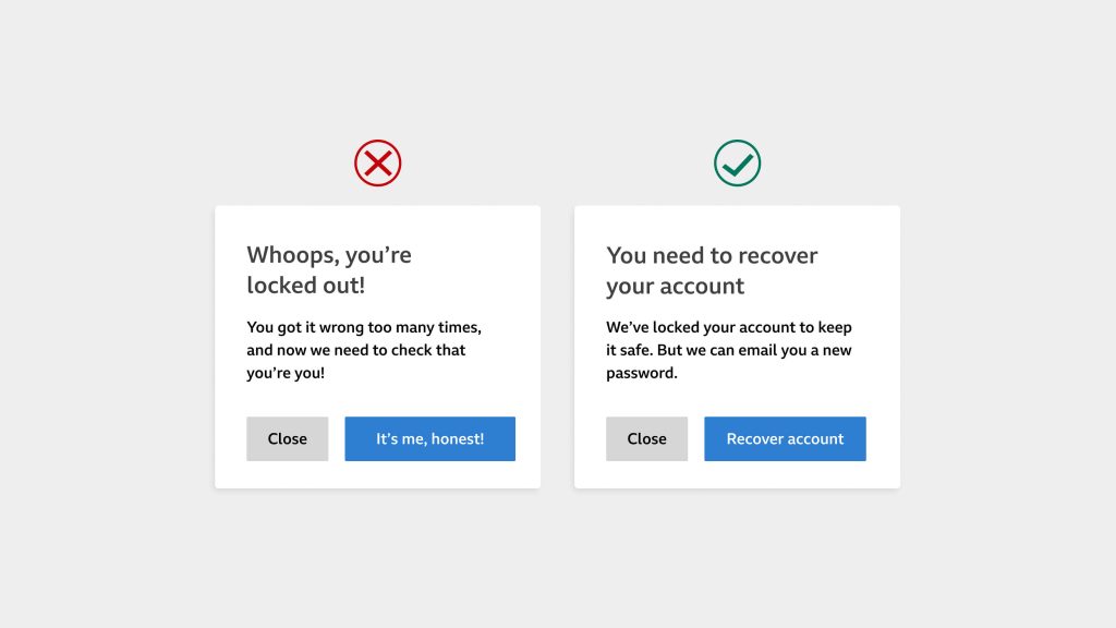
If it's totally awful, like someone is locked out of their account, now is the time to be more sincere, honest and helpful.
Understand the user's viewpoint, and the effort it takes to fix. Your account recovery journey might be short and sweet. But your user is still locked out of their account, and that's still stressful.
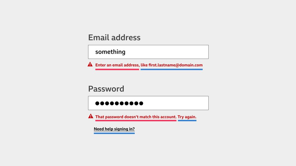
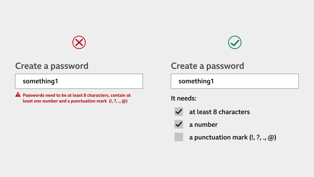
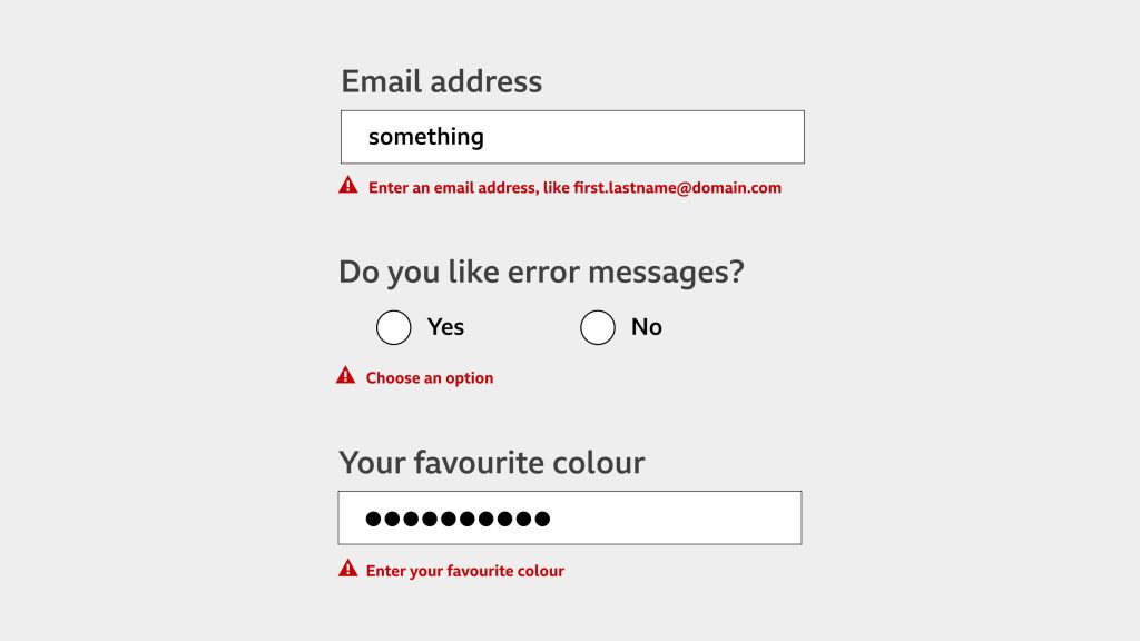
On a simple form, like a user sign-up page, it pays to account for the most common things that go wrong. You might be able to give more specific guidance to users, such as reminding them that a password will always contain a number, or an email address will always have an "@"
By working together with designers, developers and the rest of the team, you can even stop some errors from happening in the first place - win!
But if you're working on a large form, it might not be possible to cover all the different types of field validation because it would be unmanageable to build and maintain.
If that's the case, approach it systematically. Group the field types, define the most common errors and see if you can generate error messages by inserting the field label into a reusable response. Something like:
Between projects, you might need to adapt some of these ideas.
They aren't a one-size-fits-all solution to the problem. Different situations will call for different levels of detail. User testing and data needs to set that level.
But there are some good principles to follow that will always help your messages ring true.
When you write:
Error messages can be tricky. Just a few words have the power to make or break a user experience.
By approaching them systematically, you keep error messages clean and constructive. It helps to stop them from straying too far and too wide, with hundreds of errors that sound and look different from each other.
A strong writing process makes for cleaner designs, leaner code and happier users.
So worry less about the writing. Build your foundations, define a structure and then enjoy the decorating.